
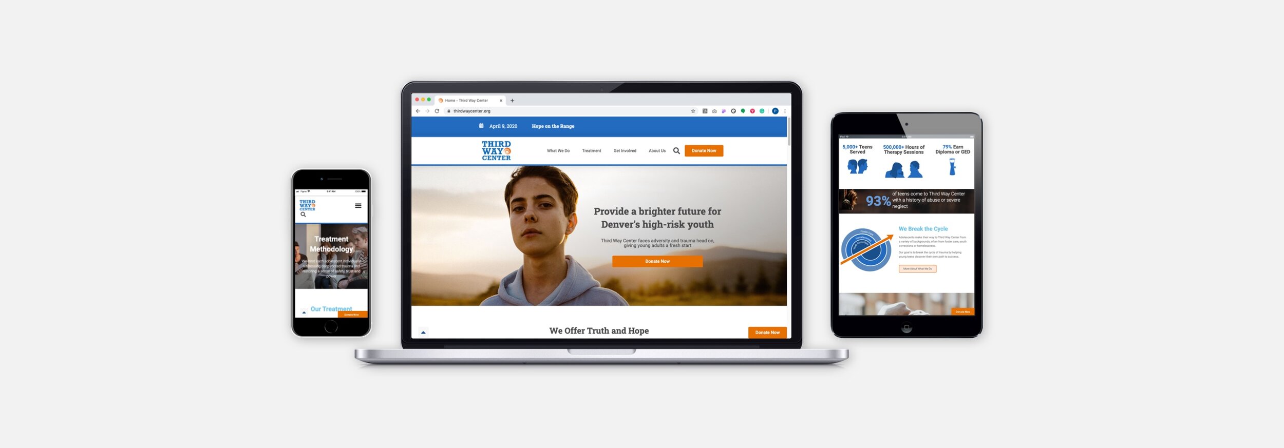
Desktop & Responsive Website Redesign
Non-Profit Organization | Colorado
Third Way Center cares for teenagers who have endured unspeakable trauma in the form of physical, emotional, sexual abuse, and neglect.
Business outcomes
Increased confidence of staff to recommend visitors to go to their site
Decreased the number of site pages from 144+ to 56, which increased scalability
Expanded marketing and social media channels for events, volunteers, and donations
The Project

Our Goals
Ensure messaging conveys Third Way’s mission of helping abused teens
Capture new millennial donor
Modernize look, feel and function of desktop and mobile sites
Build sustainable and scalable design for the organization to manage
My Role
4-person team
Lead: Contextual interviews, usability tests, design patterns, wireframes, imagery, data analysis
Collaborations: High-fidelity mockups, information architecture, messaging strategy, research, iconography, meeting facilitation
My Process
Consistent collaboration with devs and project mgmt. Understand the problem through user, stakeholder interviews and analytics. Ideate with stickies and whiteboarding. Formalize ideas through rapid prototype testing. Iterate on prototypes based on user feedback
Project Phases
Sprint 1
Research and Analysis: usability testing, charitable giving survey, interviews, Google Analytics synthesis
Sprint 2
Define and Ideate: journey map, personas, wireframes, iconography, infographics, website voice, architecture
Sprint 3
Design and Prototype: high-fidelity mockups, prototype, five single-page templates for scalability
The Problem
Will we stay relevant???
Blog it out of date. Donor base aging.
They don’t like sending people to site
Noticeable absence of millennial donors
Site doesn’t convey gravity of mission
Mission is difficult to understand
Too much text makes it hard to know what’s going on
Very difficult subject of abuse isn’t communicated clearly

Usability Testing
Website Review
6 millennials were asked to test the existing website without guidance
Participants had 60 seconds to browse
After 60 seconds we asked them to describe the site purpose
Until visitors went to several pages, they weren’t able to understand the focus. Found details on the “donation,” “about us,” “programs” pages helpful once found.
Donation Flow
Testers were given a credit card and asked to submit a donation
Donation form, confirmation screen, email receipt
Sought to understand potential pain points and delightful moments
Testers noticed a change in design. Those inconsistencies caused hesitation. Without being asked to test the site, most wouldn’t reach the donation page.
Charitable Giving Survey
16 multiple-choice questions. Results reflect survey data from two groups: 20-29 yrs, 30-39 yrs
(NOTE: Survey questions were focused on user donation experiences in general and not on Third Way Center)
What went well in your last online donation experience?

What could have been improved in that online experience?

What causes would you be motivated to donate time or money toward?

Barriers to Donating
71% of surveyed millennials noted a lack of funds as the main barrier
Transparency on how funds are used was 6x more likely to be a pain point than the 2nd most common answer (payment process)
Millennials who choose to donate are already supporting 3-5 organizations
Helping donors see that even $5 makes a difference, and how it’s used, can make donating seem manageable.

In-Person Interviews
Interviewees
Current Donors (2)
Millennials. Board members. 45-minute interview.
Potential Donors (6)
Age 20-39. 45-minute interviews
Millennials have many options of where to give. They want clear reasons why, transparency, to be thanked and followed-up with.

Key Insights
Highlight uniqueness, what sets TWC apart from other organizations.
Connect to diverse donors; teen mother, homelessness, mental illness
Strong visualization to show where their dollars go . Social sharing will enable and empower them to spread the word
Make all donors feel valued and that they’re part of something bigger than just giving money to yet another cause

Google Analytics
Visitor Behavior
11,000+ of 25,000 visitors leave without interacting with the site
14,000 visited pages to learn more about your organization
‘Get Involved’ is not one a top 10 page
Get Involved/ Ways to Give is 26th
Get Involved/ Donate Now is 33rd.
65% Desktop, 30% Mobile, 5% Tablet

SEO Review
(1st) Organic search is bringing the most visitors at 43% (the SEO is working!)
(5th) Social media visitors have the most page views (3.4 pages) and longest time on the site (2:58)
(2nd) Paid search has the shortest time on site and least page views
Organic search grew 199% over the past year
Social declined 67%, best performance: page views and time on site

Journey Map

Sprint 1 & 2: Insights Summary
Make mission and impact visible on the homepage so visitors have the insights needed to inform donating immediately
Create consistency. Same feel and branding across the site and donation flow
Acknowledge donations by thanking donors.
Redirect people back to content to stay engaged.
Reduce cognitive load by consolidating the information architecture
Highlight social media and events on the home page. They had the greatest impact on discovery
Show transparency. Clearly explain how funds are used
Align the donation flow and scale donation options with survey responses
Information Architecture
Strategy
Reduce # of pages (144+ to 56)
5 templates depending on page level
100 - Home
200 - Section Overviews
300 - Single Topics
400 - Detailed
Forms
Template types
Home, Programs, Treatment, Get Involved, About Us, Donate
Limiting the number of templates allowed for a fast build, sustainable use for the organization, and scalability


Personas
Corporate Donor - Zip Wise

Start-up, business, cloud security
“We want to provide a culture that educates and displays the effect a company can have on an community when individuals come together as a team”
Wants: Encourage our employees to be involved in local causes. Set an example for other companies both locally and nationally.
Needs: Have engagement with selected organization. A way to share our donations.
Goals: Educate and engage with philanthropic causes. Be an industry standard for philanthropic causes. Become a B-Corporation.
Pain Points: Choosing the right organization. Managing time and budget.
Recurring Donor - Lisa Lenhart

35 years old, guidance counselor, married
“It empowers me when I can help the next generation see their potential, see how much they can do, and can change.”
Wants: Give back because I know the struggle of a traumatic childhood. Help the kids of TWC because no one else has been able to.
Needs: To know that my money is going to the kids. Budget for my giving.
Goals: Advocate for mental health. Let teens know they have someone rooting for them. Share Third Way Center’s mission so that others can get help.
Pain Points: Small budget for charitable giving. Has had frustrations with site payment pages
New Donor - Dylan Livingston

25 years old, real estate agent, single
“It’s not just about stuff and what you can own, but how we can make the world a better place by giving to a worthy cause that supports my local community”
Wants: Give when I can, be thanked for my donation. Updates when I give to an organization
Needs: Transparency of where my money is going. Who it is helping. Make impact. Align with my goals or I will be less likely to give again.
Goals: Give back to community. Make the world a better place for everyone. Continue family tradition of giving.
Pain Points: There’s a large selection of great organizations. Choosing a cause where my dollar
Design Studio & Wireframes

Visual Tone
Iconography
Common icon sets portrayed abuse too literally and graphically.
We created custom graphics based on brand colors and a lighter-hearted tone.
Graphics helped lay out the components of how a resident returns to a healthy life.


Photos
How do we portray the subject of abuse photographically without showing abuse?
Third Way’s primary message is that residents gain truth and hope from their program.
Convey the arch of the story with black-n-white and color imagery.


What We Achieved
Business Outcomes
Increased staff confidence to recommend people to visit their site
Increased scalability by decreasing number of pages from 144+ to 56
Expanded marketing / social media channels for events, volunteers, and donation
