
Career Profile & Roadmap Page Redesigns
FutureFit AI | 2020 Techstars Workforce Development Accelerator
A reskilling and outskilling platform that partners with employers and governments to provide an AI-powered career GPS to individuals as they navigate career transitions.
Business outcomes
Redesigned critical pages for user testing
Career Profile, Onboarding, My Roadmap
Increased components for the design system
Summary
Client Asks
Multiple existing pages need redesigning
Translate existing user feedback into designs
Build a career roadmap page
Testing showed pain points in user journey
Resources
Figma design system
Style guide
Streamline icons packs
UX design contractor research docs
Redesign Projects
Career Profile Page
Onboarding Page
My Roadmap Page
Figma components as needed
Career Profile Page - The Problem “What do users do?”
Single-page description of requirements and outlook for a career field. User profile information will integrate with these descriptions creating a map of next steps.
Testing showed users were confused on this page
The user’s profile information wasn’t integrated in context with the role
There wasn’t any direction helping the user to complete next steps
Skills tabs don’t provide much value when they open up after being clicked
No context on how this info related to them

Iteration 1 - One Column
Integrated user profile information
Visualized user match prominently in the top right
Detailed key metrics about the career in Outlook section
Gave two clear actions under Education and Experience
Profile, Pathways, Companies, and Cities tabs would give more details without leaving the page
Iteration 2 - Split Column
Added color blocking to tab navigation to create sections
Added two columns to make it easy for users to compare
Mirrored targeted skills in each column and added checks to user skills
Increased readability by reducing graphic sizes and increasing text sizes
Iteration 3a - Complete State
Redesigned Match graphic in upper right to be more explanatory
Simplified graphics in the middle of the page
Highlighted minimum education requirements
Added more detail to Experience section in the left column
Iteration 3b - Empty State
Gave the user freedom to see anything on the site instead of forcing them to complete steps. Historically, users were blocked from seeing careers until their profile was complete.
Some sections require additional actions in order to make a match. This iteration shows what an empty state could be.
Iteration 3c - Background Color
This quick iteration shows another way to use background color to better see the information.
It flips the color from the tabs to the background of the whole site
The client is white-labeling the product so this would need to be tested

Match Component - Original Design
The match component is used throughout the site
Users need a quick-glance graphic to relate their profile to a particular career path
Iteration 1 - Headache
Hard to understand
Iteration 2 - Seeing Stars
Too much information
Iteration 3 - Stars and Bars
Confusing
Iteration 4 - Winner!
Balanced and compete
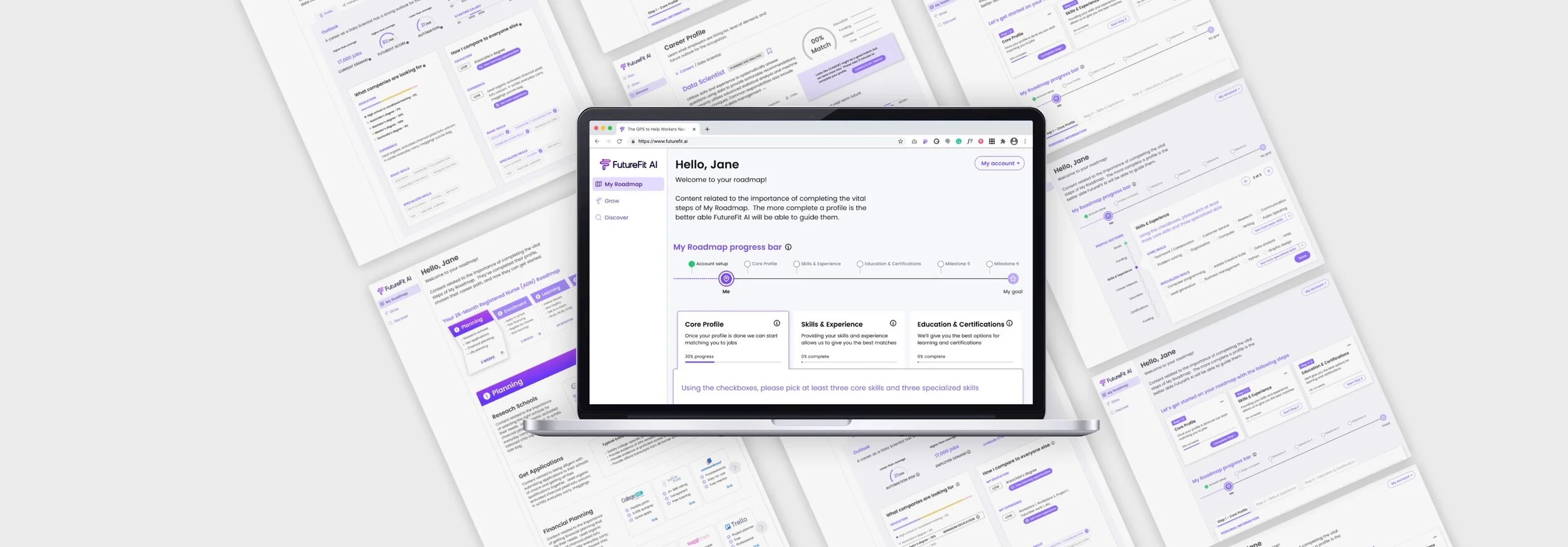
My Roadmap Page - The Problem (It’s kinda not a roadmap)
Onboarding page where users complete their profile with information related to their current skills, education, and experience that will later be used to create their career roadmap

Iteration 1 - Cards, Bar, and Tabs
Steps on cards are clear and easy to see what needs completion
The roadmap can’t be built without a profile so they get one choice: complete the profile
User has freedom to choose what they want to complete
User sees their progress on the progress bar
Steps are located below the progress bar
3 States of a Step


Tabs Section Iteration
After clicking on a step, the page scrolls down to reveal an easy-to-complete section of choices to add to their profile

Iteration 2 - Converted Cards to Tabs
Upon reflection, we removed the step numbers because the order of completion doesn’t matter
Iteration 1 had a high cognitive load: busy cards filled with step number and links, a separate progress bar, AND tabs under the bar could be confusing to the user
Connected tabs to sections leaving no doubt about what the user is working
User sees the status of their progress immediately from the progress bar