
Ecommerce Website Concept
High Country Western Wear | Colorado
A known and loved purveyor of western-style clothing and workwear located west of Denver at the gateway to the Rocky Mountains.
Predicted Business Outcomes
Longer user engagement and increased sales due to simplified navigation
Increased social media exposure through key promotions, product recommendations, and rewards programs
Summary
3-week Concept Project
Design a enjoyable responsive shopping experience
Responsive Design Patterns
Simplify navigation and information architecture
Brand & Logo Redesign
Evoke western lifestyle feel/brand across the site

Goals
Evoke western lifestyle feel/brand across site
Simplify navigation and information architecture
Design an enjoyable, responsive shopping experience
Methods
Data Synthesis, User Flows, Prototyping
Affinity Board, Mind Mapping
Personas, Competitive Analysis
Responsive Design Patterns, Gestalt
Tools
Sketch, InVision, Miro
Trello, Toggl
Sketching, Pen, Paper
Post-It Notes, Lots of Coffee
Before and After
Challenges
Busy user interface
Redundancies in navigation throughout site
No store branding beyond product logos
Site is not responsive
Before Redesign
Improvements
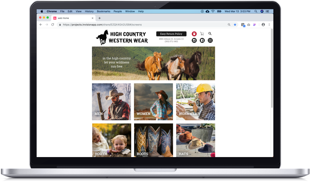
Simplify header call attentions to logo and navigation
Powerful imagery evokes the American West feel
White background allows imagery to pop
Red “call-to-action” color catches the eye for rewards
After Redesign
Research and Ideation
Mind Map Insights/Assumptions
Returns and checkout may be pain points in buying process
Would a redesign/rebrand improve sales?
Does High Country rely on online or mostly in-store sales?
Where else do customers shop?
What is most important to their customers?
User Interview Details
90 data points across 7 interviews
Male and female shoppers ranging from late 20s to early 50s
All shop online for clothes from 1 to 10 times a month
No-hassle return policy is a must
Affinity Board Insights
Users always shopped online intentionally regarding clothing and fashion trends
Expressed strong negative emotions when asked about poor online purchase experiences
Getting the right fit was a pain point due to negative past experiences
Voice of the User
“I buy with intention.”
“Make it simple!”
“Make returns easy.”
Personas
Judy

“I love the convenience of shopping online but I always worry about getting the right size and fit.”
Bio
Busy account management professional at a large tech firm
Loves fashion, dancing with friends and her fiancee, Brad
Understands style trends, wants good brand and cost
Pain point
Doesn’t like the risk of wrong sizing and hard-to-use options and tools
Frank

“When I shop online for clothes, they need to be durable, look good, and purchasing needs to be simple & fast.”
Bio
Construction business owner managing multiple projects
Needs neat, durable clothes suitable for client meetings and being on work sites
Married, 2 kids, loves his weekend time with them
Pain Point
Doesn’t want to waste time with complicated menus
Competitive Analysis
Insights
Price point of competitors varied from $25 to $500 for a shirt
Sizing solutions on product pages to ensure fit retailer to retailer
Conclusions
Standard grid design patterns were used across all the e-commerce retailers
Left side size/brand/etc. menu with right-side pictures grid


Conclusions Applied to Product Gallery
Left side size menu, right side product grid dominates the page
Clear product info under each product pic, header and menu retains navigation for user
Space for branding and searching in header, clear
Simple layout, shopping cart visible with number of items
Logo Redesign
Original Logo
Font and weight of text has a country store feel, elements feel crowded
Redesign One
Increased text size, removed mountains, added white space
Redesign Two
Solo horse evokes a sense of movement, wildness, and freedom
Sketches
Guiding Thoughts / Questions
How to capture the “high country” feel?
What font pairs with the logo font?
Patriotic, historic feel
Could pictures tell the branding story?
Would video add/subtract from the experience?
User Flows and Wireframes
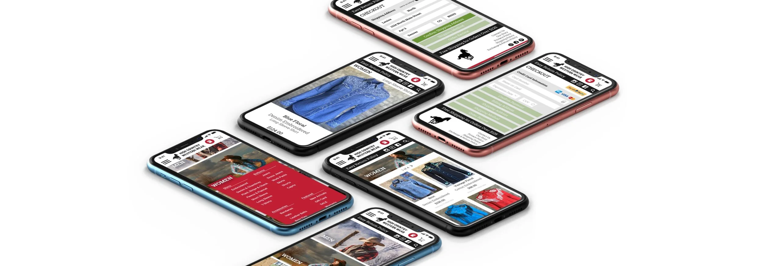
Shopping Scenario: Judy
Starting at the home page
Recently started country swing dancing
She feels out of place since she doesn’t have any western-style outfits
She Is on the hunt for a country dancing outfit at High Country Western Wear


Checkout Scenario: Frank
Starting at the “Congratulations!” pop-over
Frank ripped his favorite work shirt and needs a new one
He’s found one on his “go-to” online clothing store, High Country Western Wear
He’s chosen a shirt, added it to his cart, and is ready to checkout


Screen and Prototype

Design
Western Lifestyle Photo Assets
Powerful imagery plays role in telling the “High Country” story
Photo of the store gives a clear, real sense of place
Articulation of their 30-year history could give shoppers a strong connection
Photos depicting local events, such as rodeos, connect the shopper to spirit of the high county


Photo Assets
Consistently crisp, high-quality pictures will function as gateways to product pages
Pictures need to depict real situations people can identify and aspire to
Sprawling landscape photos can be leveraged as “hero” images to empower an expansive feel


Initial Design
Light brown behind header didn’t effectively pop the text
Light brown with dark brown text beneath each picture looked clumsy, took up space
White translucent drop-down menu was visually awkward
Cart, logo, and search icons mismatched the rest of the header due to black color and size
White capitalized text on horses image was too big in relation to the image
Design Improvements
Reduced icon size, removed menu bar under horses image
Added social media and red rewards icons. Imagery against white background allowed the pictures to pop
Pulled red from storefront image as an action color across the design
Switched white translucent drop-down menu to red with white text
Moved category titles text onto the images to get the user engaged and save space. Added drop shadow to white text on images to make text pop